Photo by Grace Nandy on Unsplash


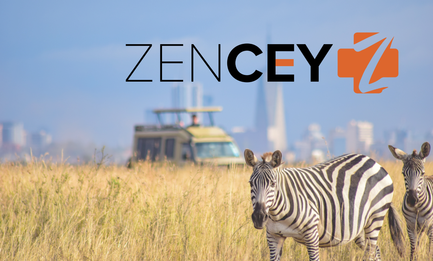
Photo by Sergey Pesterev on Unsplash
Project Goals:
▪ Re-evaluate the current experience for the existing features of onboarding, scheduling an appointment and symptom checker (AI driven).
▪ Create high fidelity mockups for new feature: pharmacy delivery.
▪ Update the overall design of the app to something simple, user-friendly, and modern.
The Team:
Heather Bolan - UX Researcher/Designer
Khanh Cao - UX Researcher/Designer
Christine Musser - UX Researcher/Designer
Jazmin Turley - UX Researcher/Designer
Yaya Mbaoua - CEO, Zencey
Timeframe:
Duration: 6 weeks (August 31 - September 12, 2022)
My Contribution:
Secondary Research, Competitive Analysis, User Interviews, User Journey Map, Affinity Map, Research Plan, Usability Test Tasks, High Fidelity Design of Pharmacy Feature

Background
In 2019, the average age of life expectancy of the average African is 56 (up 10 years from 2000), 8 years shy of the global average of 64. Increase of years thought to be a result of better access to health care, especially in treatment of infectious diseases (HIV, TB, Malaria).
Access to physicians can prove difficult due to lack of insurance and availability of doctors in the region. Zencey's goal is to provide a medical consultation service that does not depend on a patient's insurance status or the physical availability of a local doctor.
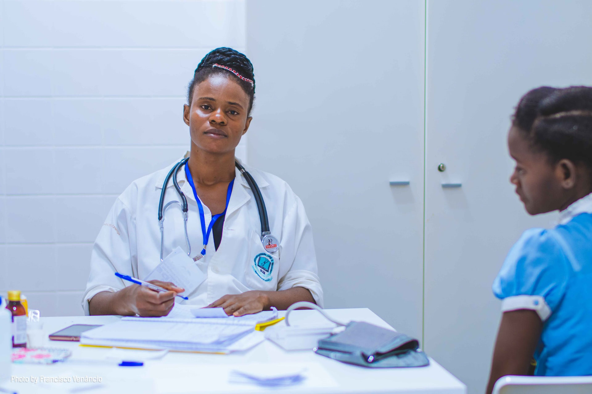
Photo by Francisco Venâncio on Unsplash

Image generated by Dall-E (Open AI)
Design Considerations
▪ WhatsApp, You Tube, and TikTok are the most successful apps throughout Africa. Possibly related to youth of the continent (60% of Africa is under age 25)
▪ Most do not own desktop/laptop computers
▪ “Next Billion Users” - new to smartphone (Android) and may have some fear in using app incorrectly/damaging phone
▪ Not all icons are globally universal
How Might We create a system of accessible healthcare for those with limited resources?
How Might We develop a mobile platform for healthcare for low level literacy/language issues?
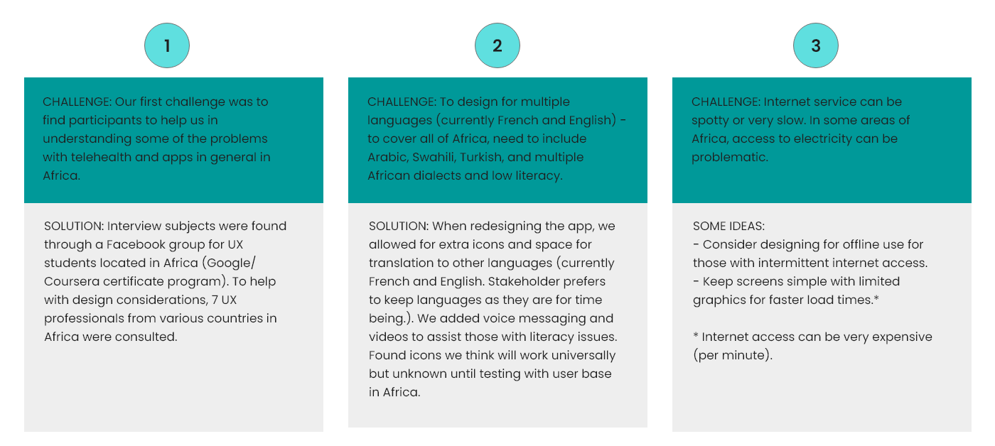
Challenges
1. Designing for a user we are not easily able to access due to language barrier/location
2. Creating an app for a continent with multiple languages and levels of literacy
3. Discovering design limitations for areas with poor internet connection and speed

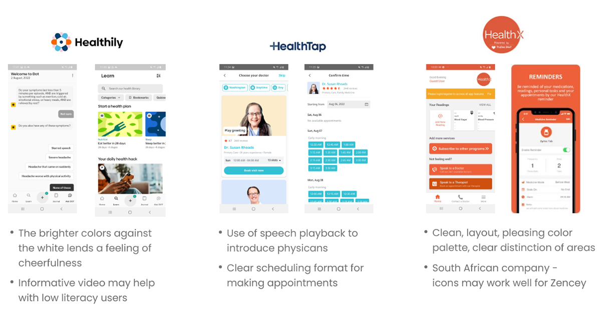
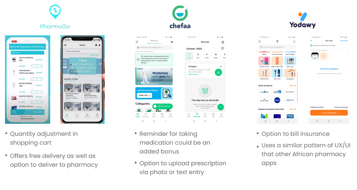
Competitive Analysis
Evaluating product offerings, unique value propositions, first impressions, features, visual design elements, and screenshots
Direct and indirect competitors featured including apps that focus on telehealth, therapy, and pharmacy delivery
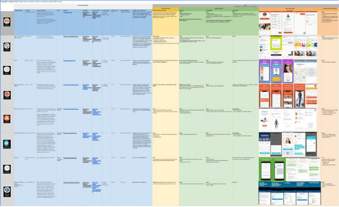
Competitive Analysis - Highlights
Competitive Analysis - Pharmaceutical Aspects
Interviews
Although unable to speak with the target user population directly, I remembered from my experience taking the Google/Coursera UX Certificate courses that there were a number of students from Africa. I contacted a few individuals from the Facebook study group that live in Africa and was able to ask them a few questions regarding use of telehealth, internet access and language/literacy issues.
Customer Journey Map (Generic Health App)
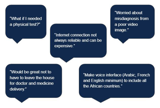
▪ Frustrated due to lack of physicians online and in person
▪ Desire to go directly to pharmacy (avoid need to talk to MD)
▪ Concern about image quality and correct diagnosis
▪ Confused about how it works
Photo by Joshua Oluwagbigma on Unsplash
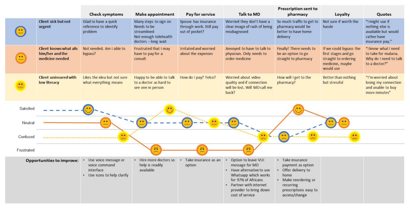
Photo by Nicholas Gray on Unspash
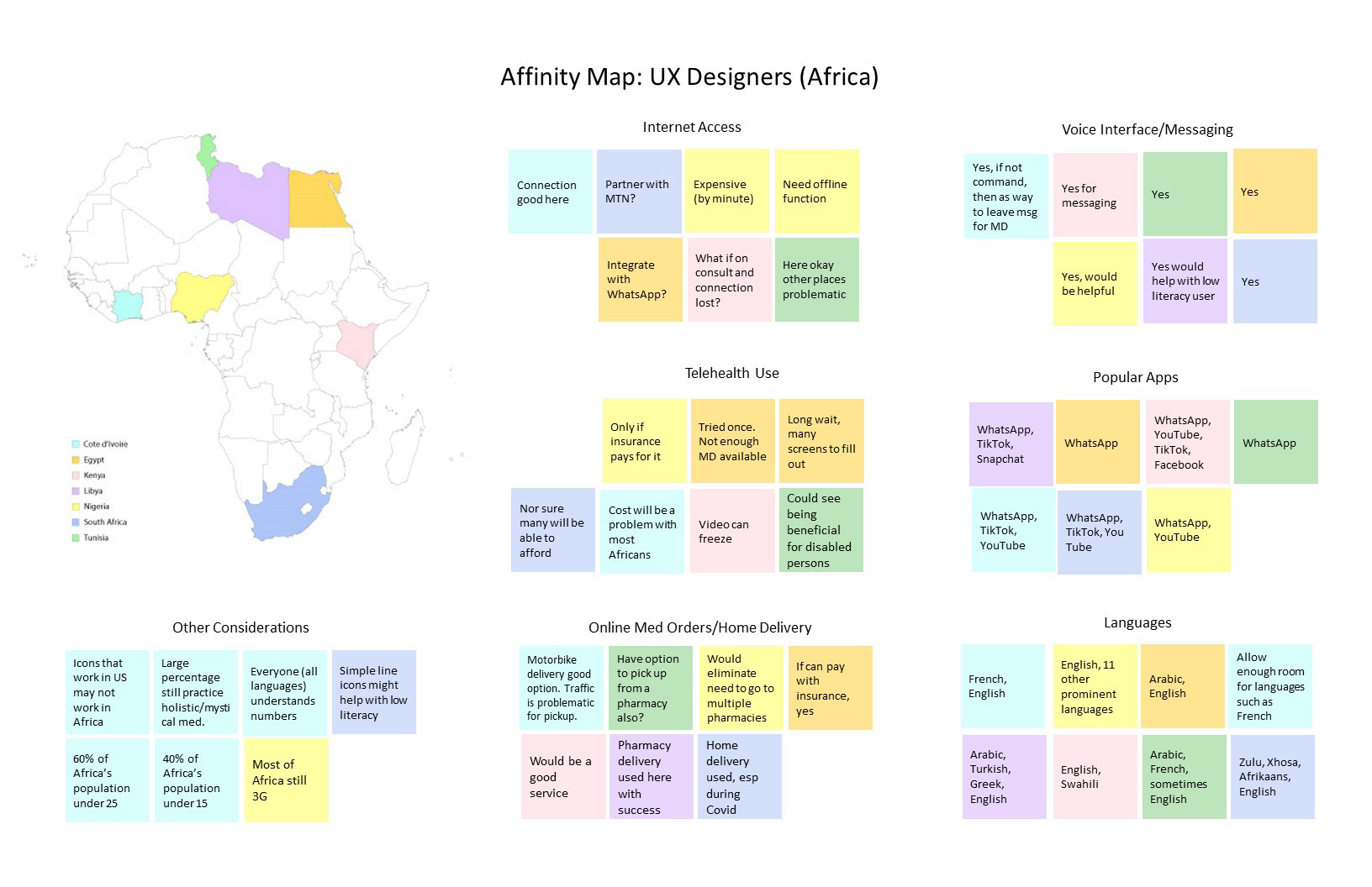
Affinity Map: UX Designers (Africa)
Notes from conversations with 7 African UX professionals to gain insight into problem space
▪ Icon use helpful for low literacy users
▪ Use a similar format to WhatsApp since well known
▪ Voice interface/messaging recommended
▪ Offline functionality suggested as internet connection and access to electricity can be problematic
▪ Partner/integrate with WhatsApp or MTN/telecom company to increase stability of internet connection

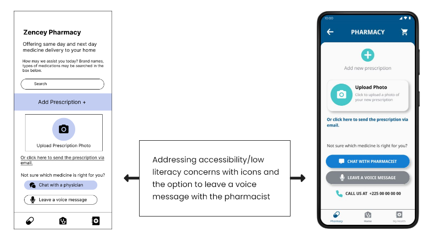
High Fidelity Mockups for New Section: Pharmacy
I designed wireframes and high fidelity mockups the new pharmacy/medicine delivery feature (based on the same style guide/redesigned sections by my teammates).
Delivery of medicine to home is highly sought after for several reasons:
▪ Traffic congestion - which is one reason why motorbikes are very popular and often used for deliveries for the ability to maneuver around cars and also less expensive to own
▪ Difficulty in reaching the pharmacy (lack of transportation, too far away)
▪ Items often out of stock requiring trips to multiple locations

Photo by Opeyemi Adisa on Unsplash
High fidelity mockups (below. Click to enlarge) were not included in the usability testing that follows as it was a new feature and not part of the first usability test using the original concept.
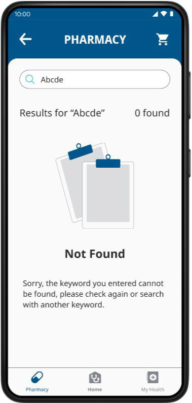
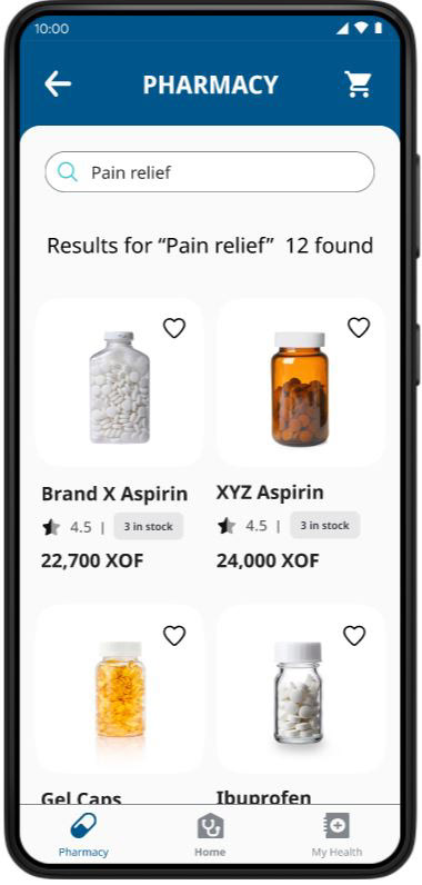
Search for items within pharmacy. Consider adding Speech option.
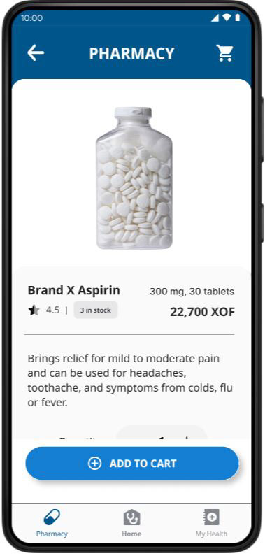
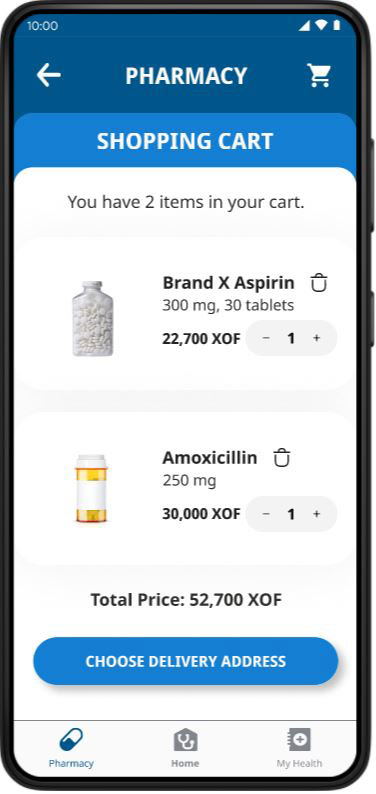
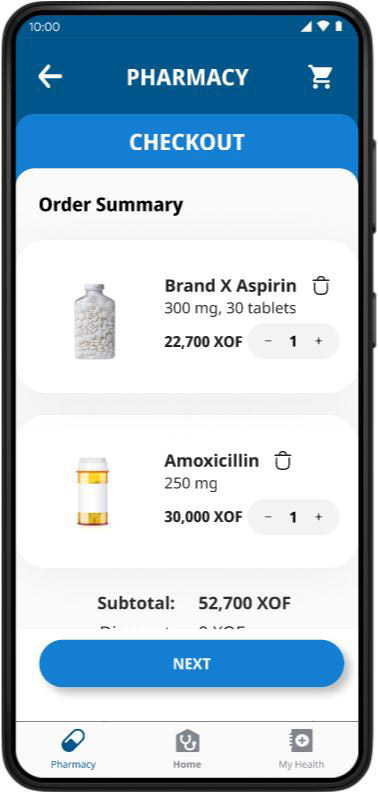
Cart with items added. Note: the prescription will either be disabled for Quantity or removed (consult with developer as which is preferred)
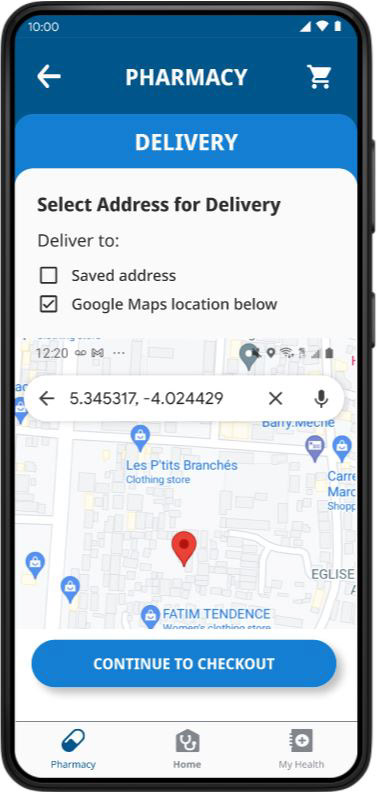
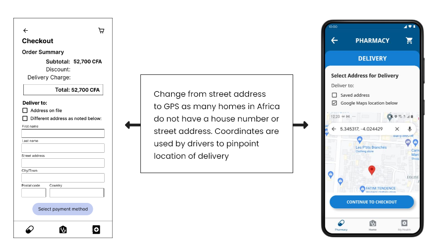
Many African homes also lack a house number and street address hence GPS coordinates are required.
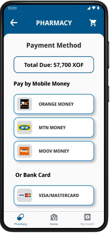
With current app, customers are sent to an outside vendor for processing and then return to site for confirmation/details of order.
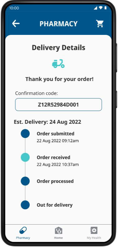
Deilvery information page indicated status.
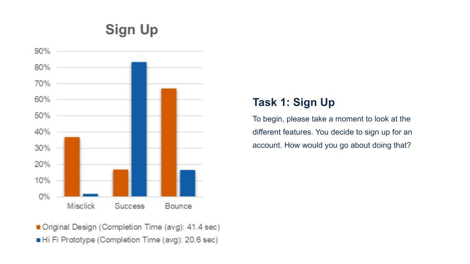
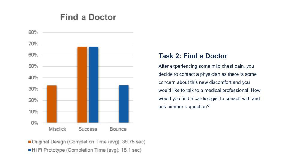
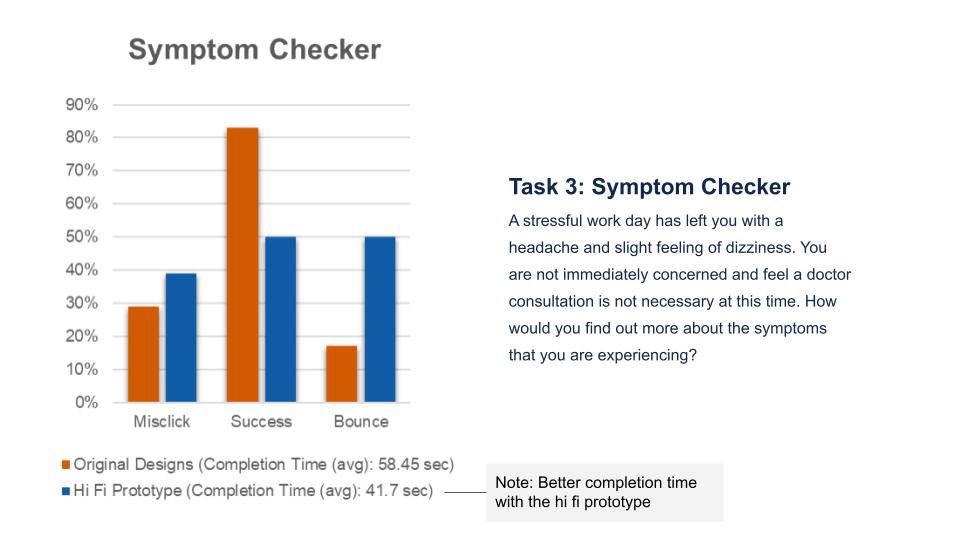
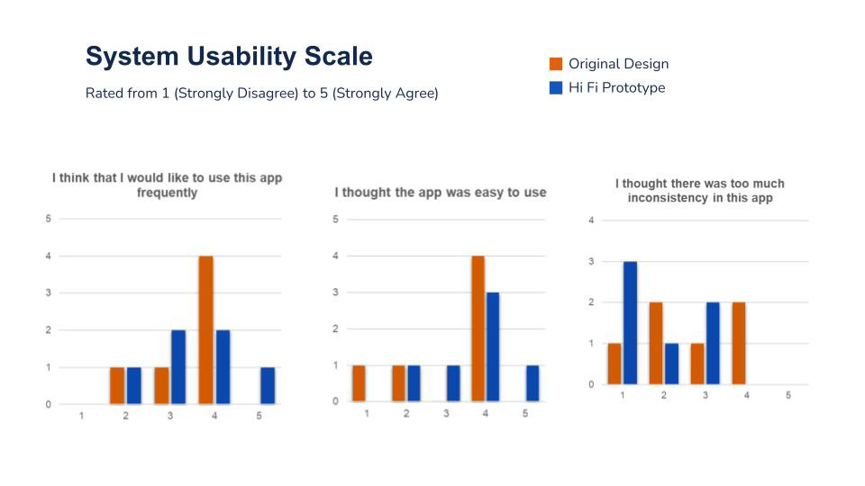
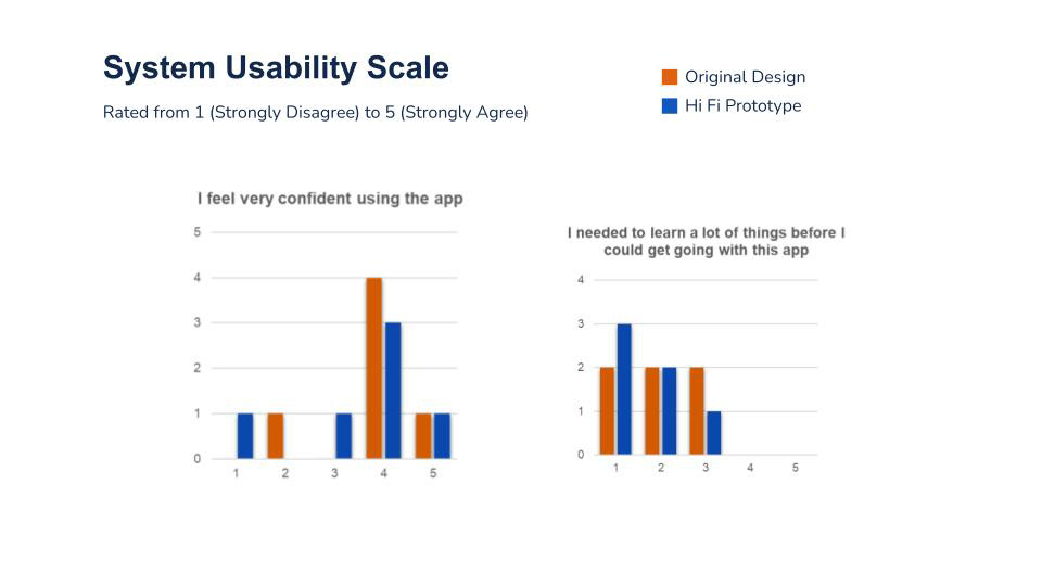
Unmoderated Usability Testing
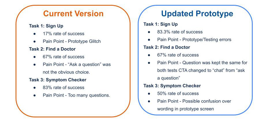
We performed 2 rounds of usability tests using the Maze platform. KPI's for both included Time on Task, Error Rate and System Usability Scale questions. 1st test done with screenshot of the original design. 2nd test with the hi fi prototype. Test participants for both had age range of 18-65 with location in continental US with the exception of 2 African testers on the 2nd test. Tasks/questions by C. Musser and Maze prototpe by K. Cao.
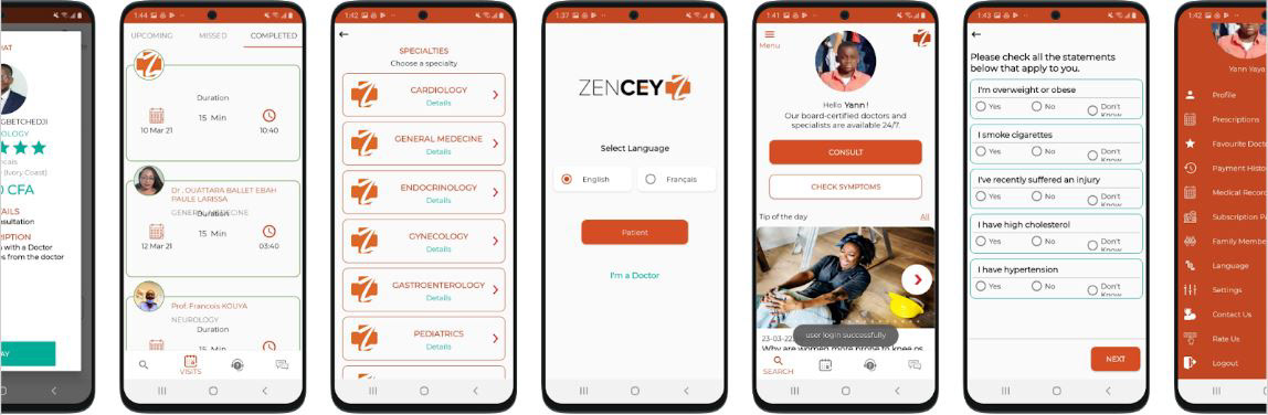
Original app design (used for Test #1)
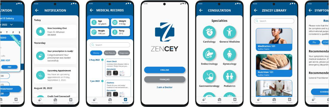
Hi Fi prototype (used for Test #2) by K. Cao, J. Turley, and H. Bolan

Next Steps
▪ The most critical next step: Need to test with users located within Africa to gain accurate feedback
▪ Consider a partnership with WhatsApp or one of the telecom companies to reduce connection issues and possibly cost to user
▪ One of the concerns about using telehealth apps was the fear of misdiagnosis by blurred image. Tytohome has a handheld camera device available for home use which offers high quality photo/video images a physician can view in real time
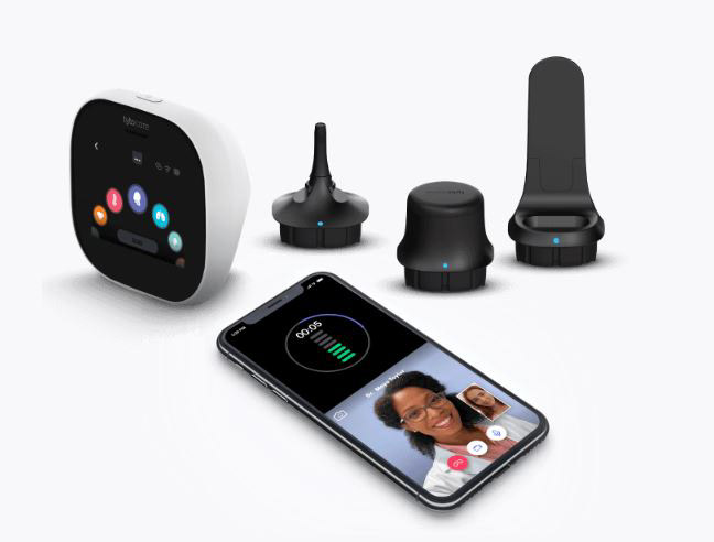
TytoHome kit from TytoCare

Deliverables
The original request of the stakeholder was for a redesign for four features instead of three with the fourth being Chat. However after the initial meeting where the scope had been discussed, he expressed more interest in seeing mockups for a new pharmacy order/delivery feature and was willing to drop the Chat and substitute the mockups of the Pharmacy feature.
Deliverables included: icons and other graphic assets, research from interviews, copies of both presentation slide decks (Research and Final Design), research plan, and Figma file containing all high fidelity designs.
Happy with the results, the stakeholder said he would keep in touch and let us know the progress of the app.
Takeaways
▪ To gauge how effective the changes made in the app redesign, testing with the target audience is crucial.
▪ May design a A/B test using screens from original design and new version and ask the Africa based students from the Google course to test. Google Forms might be the best format for this as it allows for language translation.
▪ Developing for the immediate area around Cote d'Ivoire and resolving for those issues first might be a preferred course of action. There are many variables to solve for once expanding to other countries
Photo by Denis Ngai on Pexels